Loading...

Invest Ontario

Invest Ontario, an organization dedicated to promoting the province as a top destination for direct investment, wanted a video that would showcase Ontario's unique, diverse, forward-thinking, and innovative qualities, helping the province stand out from its competitors.

We created an animated video that showcases Ontario's key strengths. The video highlights the province's highly educated and diverse workforce, advanced industries and technological prowess, abundant mineral resources, transformative life science innovators, and access to global markets. The use of animation makes the video engaging and intriguing for viewers.

In addition to the animated video, we also created a series of social media cut-downs that highlight key aspects of Ontario's value propositions. By using animation in their social posts, Invest Ontario is able to make their communications more alive, engaging, and intriguing, while promoting Ontario's value propositions to potential investors.

Overall, we are proud to have created an animated video that will help Invest Ontario pitch Ontario to the world as a top destination for direct investment. By showcasing the province as unique, diverse, forward-thinking, and innovative, we are confident that we have helped Ontario stand out from its competitors and attract the attention of potential investors.

Development Services Ontario (DSO)

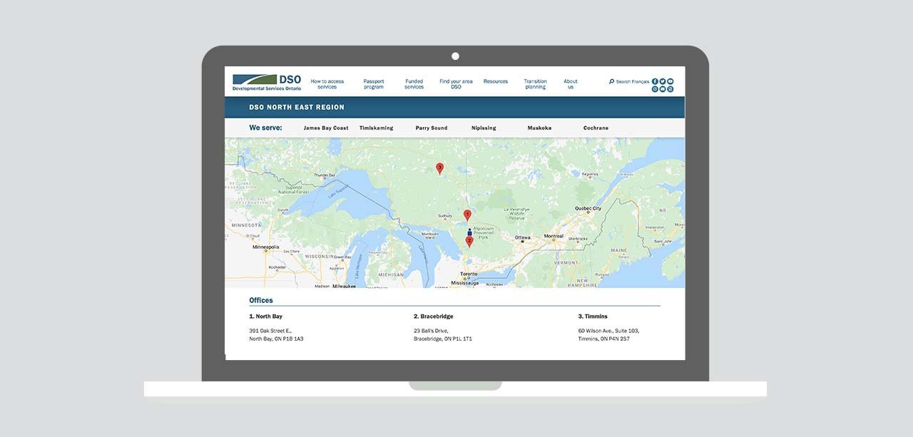
DSO is the access point for adult developmental services in Ontario. The challenge was to create an information and application portal for young adults and their caregivers to determine available supports, connect with local DSO agencies, and understand and begin the application process.

Animated explainer videos, also used in social media, help users learn about DSO services in a friendly and easy-to-understand way, engaging the younger audience.

An interactive wizard walks users through the application process to help determine eligibility for services. Users can then easily submit eligibility documents, streamlining the intake process, reducing costs, and improving client service.

An interactive map uses current location or postal code lookup to find the user’s local DSO quickly, reducing calls to the central office.

Northern Ontario Heritage Fund Corporation (NOHFC)

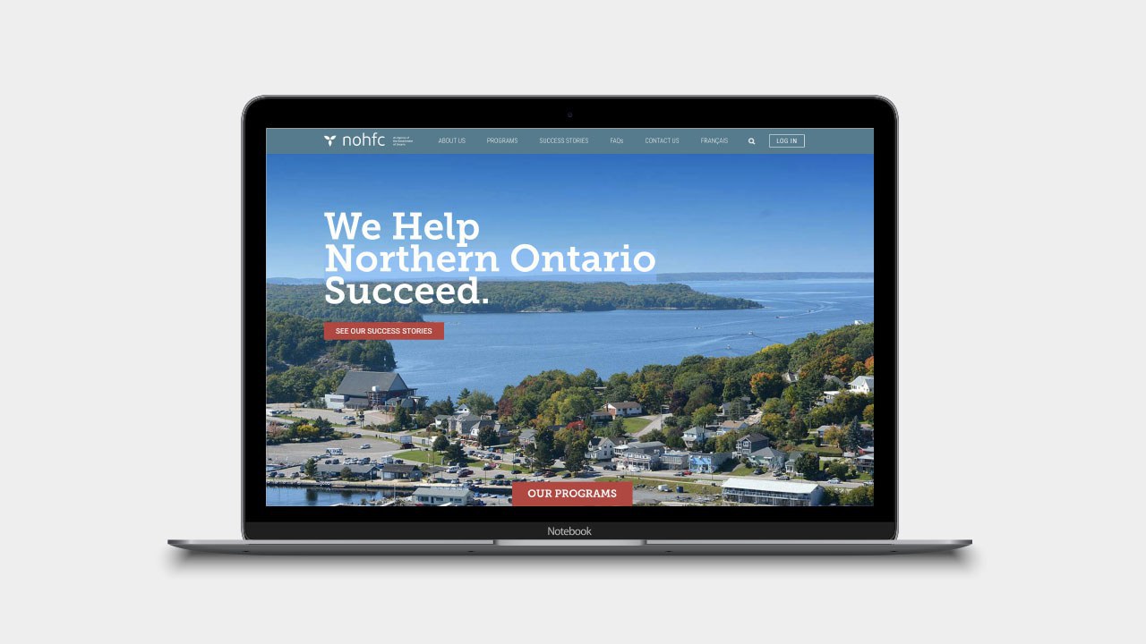
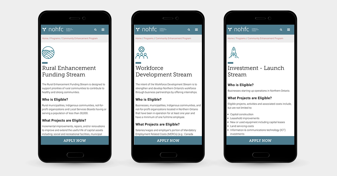
The Northern Ontario Heritage Fund Corporation (NOHFC) approached us to create a website that would make it easy for businesses and municipalities in Northern Ontario to apply for government funding to promote economic growth and diversification.

The result is an online application portal that includes a multi-session and multi-part online application form, allowing applicants to more easily complete their application. The website also includes a dashboard that provides a quick overview of the application status and allows applicants to track the progress of their application.

In addition, the website features a commenting and help system, allowing applicants to get assistance from advisors and to collaborate with team members on their application. This system ensures that applicants have the support they need to successfully navigate the application process.

Aside from the online application portal, the website also includes a wealth of resources and information for businesses and municipalities in Northern Ontario. These resources include information on funding opportunities, success stories from other businesses and municipalities in the region, and links to relevant organizations and services.

Overall, we are proud to have delivered a website that will make it easy for businesses and municipalities in Northern Ontario to access the funding they need to grow and diversify their economies.

Music Canada Three R's Music Program application form on laptop with hands on keyboard and music instruments nearby.

Music Canada

In Ontario, music education is a key component of the school curriculum. But as with all things, musical instruments need occasional repair and refurbishment to keep them in top working condition. That's where the "Musical Instrument Repair and Refurbishment Grant Application" comes in.

This innovative web portal allows schools to easily apply for funding to repair and refurbish their musical instruments. The application process is broken down into manageable steps, making it easy for schools to complete in multiple sessions. Plus, the portal's upload as CSV file function allows schools to upload their data directly from their internal sources, saving time and effort.

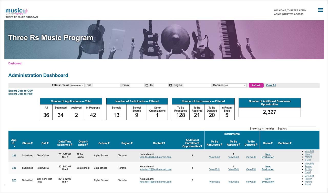
But the magic doesn't stop there. A back-end dashboard tracks and manages the applications and instrument inventory in real-time, streamlining business processes and workflow. This ensures a smooth and efficient grant application process for schools across Ontario.

Music Canada Three R's Music Program Backend Dashboard

Thanks to the "Musical Instrument Repair and Refurbishment Grant Application," music education in the province is flourishing like never before. Schools are able to access the funding they need to keep their instruments in top shape, allowing their students to continue making beautiful music for years to come.

Music Canada Cares Home Page

Ontario Creates

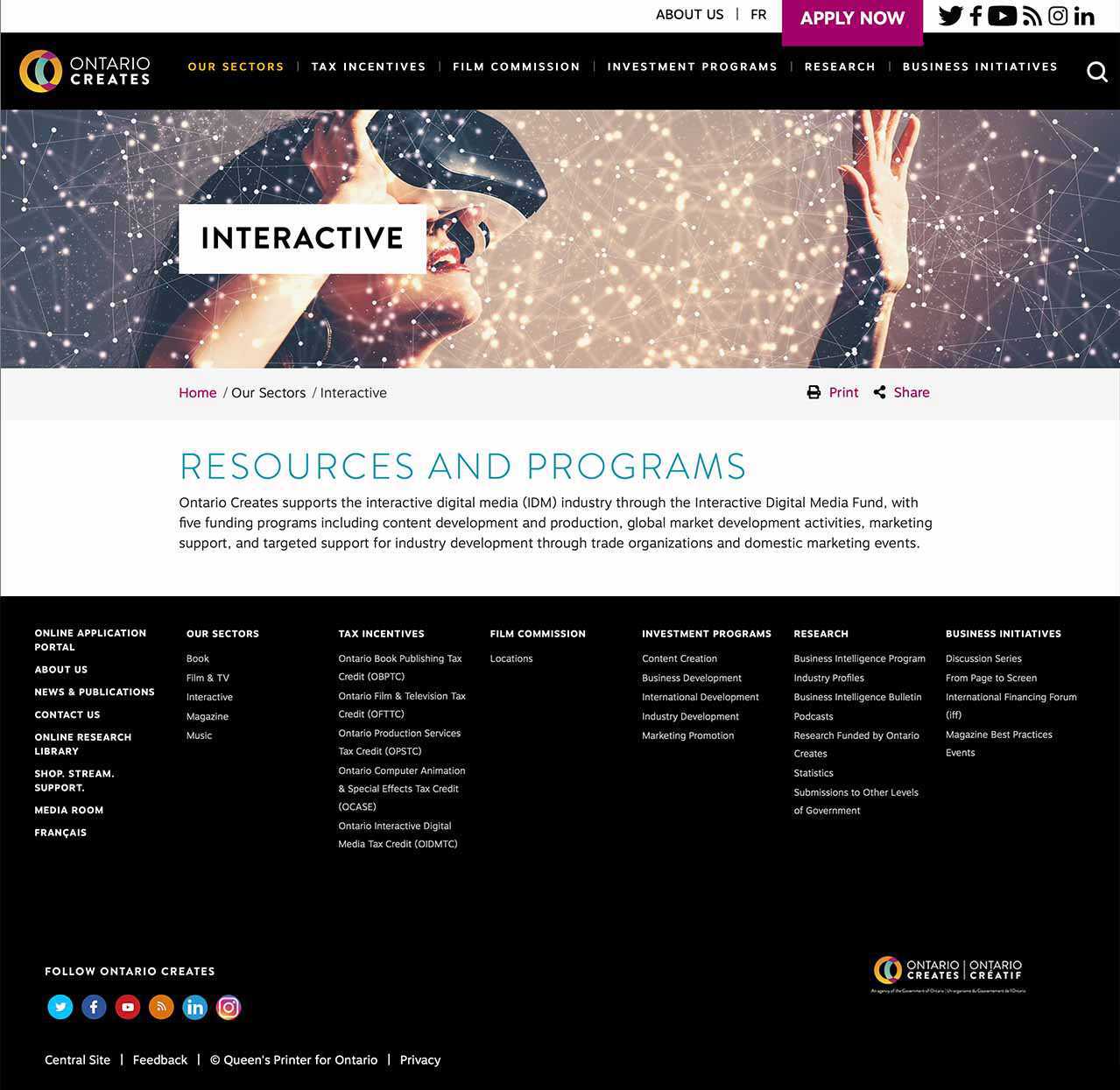
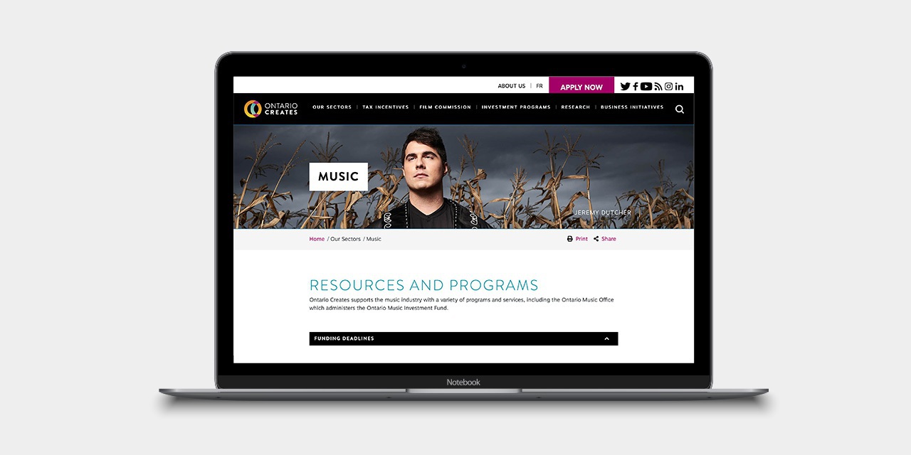
The redesigned website for Ontario Creates features a bold and innovative design that pushes the boundaries of user experience. As soon as visitors land on the home page, they are greeted with stunning graphic elements that appear and animate as they scroll down the page. This interactive design immediately captures the attention of visitors and sets the tone for the rest of the website.

The homepage also includes a clean and intuitive navigation menu, allowing users to easily find the information they need. Whether they are looking for information on funding opportunities, events, or the latest news from Ontario Creates, they will be able to quickly find what they are looking for.

As visitors explore the website, they will be impressed by the creative and engaging design elements that are featured throughout. From eye-catching graphics and animations to clever use of color and typography, every aspect of the website has been carefully crafted to provide an exceptional user experience.

Overall, the redesigned website for Ontario Creates truly lives up to the agency's name, showcasing the creativity and innovation that is at the heart of everything they do.

Ontario Heritage Trust (OHT)

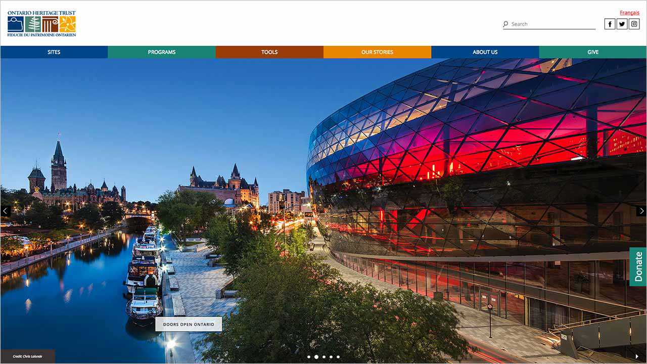
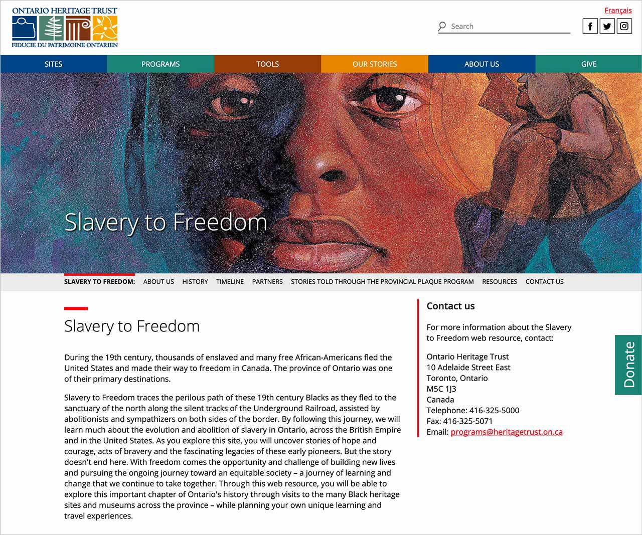
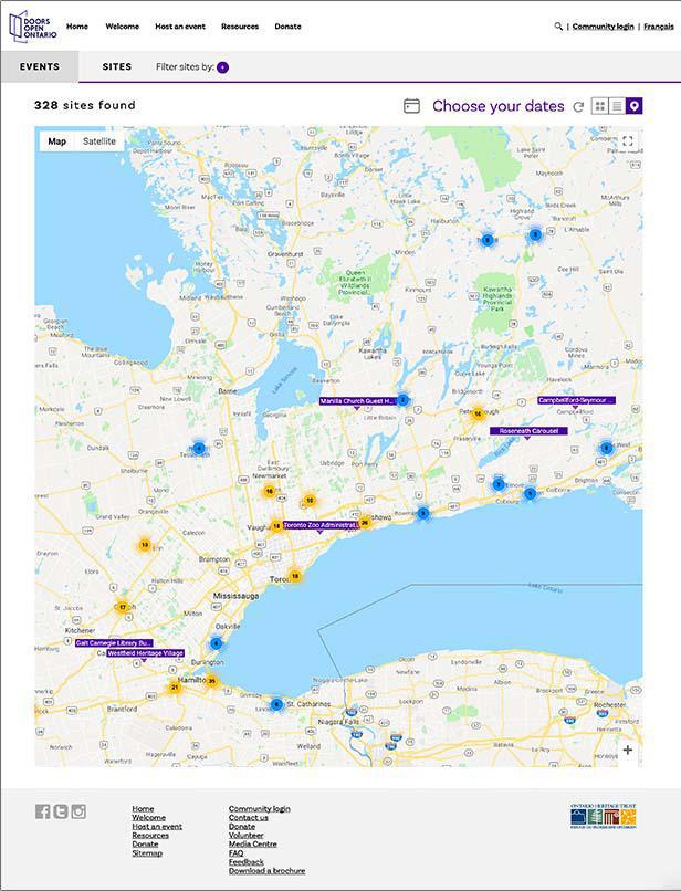
A website that showcases Ontario's places and landscapes, histories, traditions and stories that embody its heritage. Users can easily find and browse heritage buildings, museums, and natural sites by location and use search tools to find information in databases about heritage plaques, places of worship, and even search for properties in Ontario that have been designated using the Ontario Heritage Act (OHA). This website successfully contributes to this organization's mission to share knowledge and expertise, and foster an understanding of Ontario's histories and heritage in everyday life.

Doors Open Ontario

From historical houses to modern marvels of construction, Doors Open Ontario opens the doors to hundreds of buildings, natural spaces, infrastructure and cultural landscapes that shape and define Ontario’s communities. The challenge was to inspire visitors to attend these events and sites, and make it easy to plan an excursion. We created a visual interface with architectural images to entice visitors. We added convenience features such as maps and filtering to make it easy to find attractions based on location and interest.

WCD

In 1952, West Canadian Digital (WCD) was founded in Calgary, providing digital print, signage, and document management services to businesses in the area. As the company grew and evolved over the years, they realized that it was time to embark on a rebranding strategy to create a foundation for emerging opportunities and stay ahead of the competition.

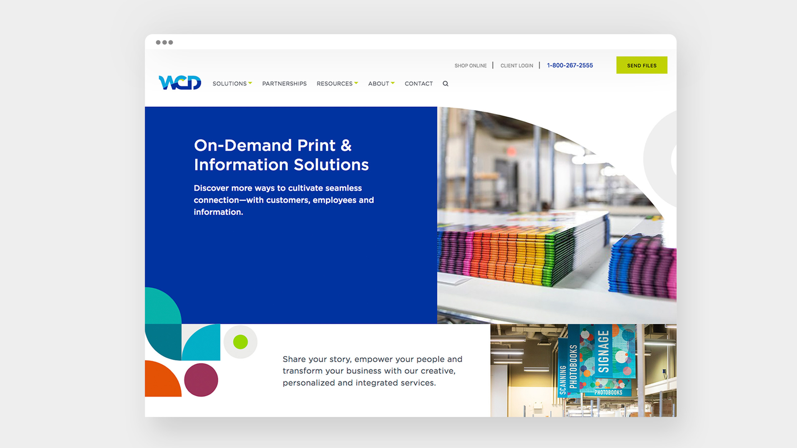
WCD turned to our team of branding experts to help them modernize their image and create a new website that would be at the forefront of the company's future. As a classic and reserved brand, the challenge was to make WCD more modern and expressive, while still maintaining their core values and focus on the human element of the business.

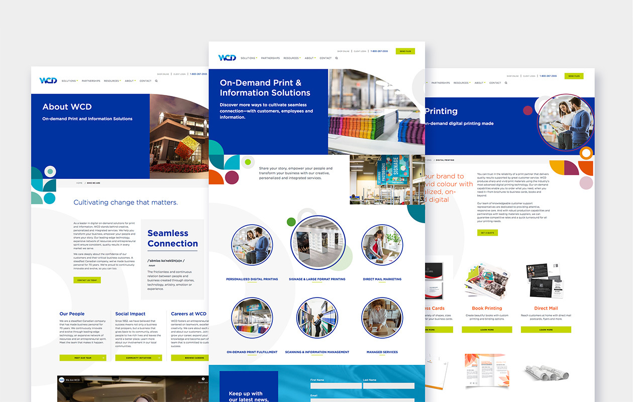
After careful consideration and collaboration with the WCD team, we developed a brand identity that was both playful and corporate, with a simple design featuring purposeful whitespace, layered colors, and curved elements. The typography was soft and welcoming, creating a warm and approachable feel for the brand.

For the new website, we created a streamlined navigation system with multiple calls to action to engage users and encourage them to contact the company. The website is now the cornerstone of WCD's rebranding efforts, and we are proud to have been a part of their journey.